TV Watching vs. Physical Activity

Do people who watch a lot of TV not do much physical activity?
Check out this relationship in your classroom!
Brief Lesson Explanation:
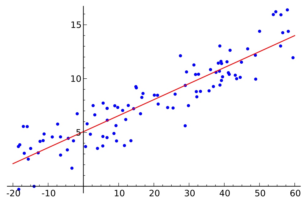
In this lesson students will learn to how to create linear models for bi-variant data using a graphing calculator. The students have been learning about linear equations, what consists of linear equations, such as slope and y-intercept, as well as learning about bivariate data, correlation, correlation coefficient, and what it means to find the regression model, specifically just linear regression or “line of best fit.” Students are able to find the line of best fit given data by hand. Following this lesson student will have the opportunity to use classroom gathered data and learn how to find correlation and regression models using a graphing calculator. Students have worked with finding linear regression models with bivariate data, but have not had the opportunity to work with technology to enhance their learning.
The graphing calculator will help with the “difficulty” of finding the correlation coefficient and will help students check if they have indeed found the correct line of regression. The graphing calculator also helps students to see a visual representation of the data. Since it takes less time to find the correlation and linear regression with a calculator, students are able to take more time into explain their knowledge of the correlation coefficient, and how their correlation support the regression model they chose. Students are also able to begin understanding of what the slope and y-intercept of their data truly means and its significance to the data. Students will also begin to make connections about how the regression model can be used to make further predictions on their data.
Integrating Technology in the Mathematic Curriculum:
This lesson helps students meet the modeling Common Core Standard S.ID.7: Interpret the slope (rate of change) and the intercept (constant term) of a linear model in the context of the data. * (Modeling Standard), because this lesson helps students to use data from their own classroom (raw data) to find the best regression model, and then use their prior knowledge of slope and y-intercept to explain how these two concepts shape the data, their significance to the data, and then make predictions using the regression model. Using the graphing calculator to find the accurate regression model that best fits the data, by using the correlation coefficient to justify their answer, students are deepening their understanding on how the regression model is used to find a relationship between the data and is also used to make further predictions pertaining to the data. Students are also understanding that slope is really the “rate of change” between two points and that the y-intercept is the “starting point” or “basis” of the function.
Participation in Community of Mathematics Educators:
Yes, it is important for students to know how to find regression models by hand, but by being able to use a graphing calculator, students are presenting the knowledge of using technology to advance their learning. By learning this concept, students can show that they can collect data, find the regression model that best fits the data and fully support regression model fit. This lesson is a great way to help students strengthen their knowledge of the importance of regression models and how regression models help to explain the relationship between data by correlation (if applicable) and also helps to make further predictions pertaining to the data. This lesson also allows students to use technology, a graphing calculator, to help them to input a lot of data more quickly and make an accurate scatter plot. Then, students can make several generalizations using the data. For example, with a graphing calculator students have the opportunity to check various regression models one right after the other, and use their knowledge about the correlation coefficient, r^2, to explain which regression model is actually correct. By working with data the students have also gathered on their own, and after finding the correct regression model, students are able to take their classroom data to explain how the parts of the regression model (in this lesson’s case linear regression) and explain the real-world meaning of slope and y-intercept.
Ability to Contribute to Program and School Improvement:
This lesson allow the teacher to teach in various ways: through direct instruction, video enhancement, worksheet activity, peer interaction, individual student work, and a class discussion. By allowing various teaching methods, this lesson is a great way to help enhance students’ learning about regression models (in this case, linear regression).
Planning for Mathematical Instruction:
This lesson meets the above shown Common Core Standard because the worksheet directly aligns with standard statement. This lesson builds upon students’ prior knowledge of linear equations, correlation coefficients, scatter plots, and regression models. The learning targets guides students into learning about the “real-world” interpretation of their data and how their regression model can explain the rate that the data is either increasing or decreasing (if applicable) and its starting point (y-intercept) and its value to the data. After inserting their data into the graphing calculator, graphing their scatter point, and checking various regression models against their data, students are making clear and consistent connections on what is truly the “best fit model” for their classroom based data. Proving that students truly understand the importance of the correlation coefficient, , and its value into determining which regression model truly explains the data.
Planning to Support Varied Student Learning Needs:
This lesson support varied student learning needs by offering the student various to learn the concept. First, the lesson provides the teacher a teacher’s resource packet that includes: definitions and explanations for correlation coefficient and regression line, has steps for how to solve for the correlation coefficient and linear regression by hand, has three videos the teacher can use to teach the students how to use their graphing calculator to insert data, create a scatter plot, find the regression model, and graph the regression model along with the regression model. The lesson allows includes a step-by-step visual representation of how to use the graphing calculator for students in the student packet that students can use to follow along when teacher (or video) is instructing students how to use graphing calculator or it also serves as a resource for the students to use after teacher gives direct instruction. The graphing calculator allows students to visually see their data, to compare various types of regression models, and use their knowledge of the correlation coefficient, to explain which regression model is the “best fit.” Completing this activity by hand would be more time consuming and students would need to know how to calculate various types of regression models also by hand, not only linear regression. Also, during this lesson students also have the opportunity to work individually, in pairs, on their worksheet, and as a class, so students have various ways that the information they are learned can be expressed. Their knowledge will be assessed through peer interaction when written scatter plots are created, informally when their graphing scatter plots are created and they verify their scatter plot with the teacher’s scatter plot shown on the overhead or with peers, and again informally with a partner when the “correct” regression model is chosen and justified on their worksheet. Then, student will be assessed formally through the grading of the worksheet and through the class discussion at the end of the lesson.
Using Knowledge of Students to Inform Teaching and Learning:
By knowing your students, a teacher can prepare for common mistakes and misconceptions that may occur during the lesson. This activity will be beneficial to students because it offers them the opportunity to take data, from their own classroom, and find the regression model which best fits. Students can then in the next lesson, pick two bivariate relations which interests them and find their own regression model, explain the regression model type, how they know their regression model is correct, what the regression model states about the relationship between the data (if applicable), and what future remarks could be made pertaining to this data. By being able to this very important mathematical concept, students can then find relationships between any relatable data which can be used in their future careers.
Planning Assessment to Monitor and Support Student Learning:
The teacher maintains rapport and respect with the students by making sure that students are being able to follow along with the lesson and answering questions referring to the regression model worksheet or technology questions. The teacher also retains rapport with the students by creating a learning environment which allows the students to learn in various ways: through teacher (or video) direct instruction on using the graphing calculator, and student support on the use of technology on the student worksheet: “References” for using the graphing calculator. By having the ability to work both individually and in pairs, students are expressing their varied perspective and ideas on the meaning of the slope, y-intercept, justifying their regression model, and making further predictions. This lesson promotes mutual respect among students because it offers students the opportunity to correct and interact with each other using mathematical support to build and enhance their knowledge. Therefore, this lesson is allows for varied assessment which monitors students’ learning through teacher walking around and assisting thought the lesson, students interacting with their peers, and by completing the attached worksheet.
Math-325-Modeling-Activity-Lesson-Plan
Math 325 Modeling Activity-Student Packet
Math 325 Modeling Activity Teacher Guided Class Discussion Questions
Math 325 Modeling Activity Grading Rubric
Math-325-Modeling-Activity-Teacher-Reference-Packet


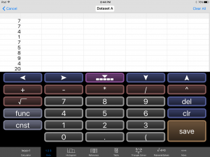
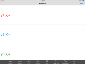 Pushing this opens a new menu that has more options in the upper right hand corner called Mode, and just wait there’s more. If you push the Mode button it opens? Yep, you guessed it, another menu with more feature!
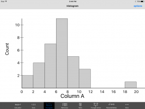
 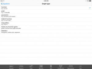 This time click the Statistics option and hear that ‘click’ sound play your favorite tune. ‘Click.’ Now don’t go away, if you place your order today we will throw in, for absolutely free, that’s right, absolutely free data set entry into a spread sheet. Just enter your data set. Then here comes my favorite part, are your ready? Click the Histogram button at the bottom of the screen and ‘presto’, your histogram has been summoned. Turn every student in your class into a Mathamagician. That’s right! A Mathamagicaian, and bring your lessons to life. And if you order your copy of GraCalc between now and Armageddon, I’ll cut the cost in HALF. That’s right, In half. Not good enough, you say? Well finish reading this blog and I let you have the app for my famous low, low, super duper, can’t get a better deal anywhere price of… are your ready? FREE, Yes I said it, Freeeeeeeeeeeeeeeeeeeeeeee.