Logger Pro Ball Throwing Project CCSS 8.F.A.2

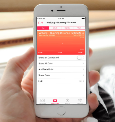
Have you ever had a difficult time finding a math project that is both engaging for students and involves technology? Vernier products are wonderful tools for projects such as these, that can be very difficult to implement in the classroom. However, with these tools there are infinite possibilities for engaging projects. One product that is popular is called Logger Pro. This software allows students to take videos of any motion or movement and upload those videos to Logger Pro. Logger Pro can then plot those motions in relation to both the x and y axis, and allow students to find regression lines through the data points. This software is a way for students to be creative and see the connections between the math that they are using and the real world. For more information about Logger Pro, visit: http://www.vernier.com/products/software/lp/


logger-pro-picture-example

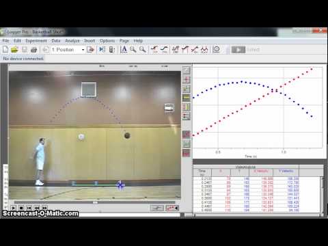
An example of a great project for students to do with this Logger Pro Software is a project where students get into groups, film each other throwing a ball back and forth with different speeds and different heights, create the plot points of the movements on Logger Pro, find the regression equations of those points in relation to the x and y-axis, and then analyze the differences between the throws and their relationship to the matching graphs.


sports-balls

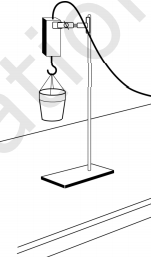
For this project, students will need some extra materials such as a video camera (can use phone), a ball of their choosing, and Logger Pro.

The standards that align with this project are:

CCSS.MATH.CONTENT.8.F.A.2

Compare properties of two functions each represented in a different way (algebraically, graphically, numerically in tables, or by verbal descriptions). For example, given a linear function represented by a table of values and a linear function represented by an algebraic expression, determine which function has the greater rate of change.

CCSS.MATH.CONTENT.8.F.B.5

Describe qualitatively the functional relationship between two quantities by analyzing a graph (e.g., where the function is increasing or decreasing, linear or nonlinear). Sketch a graph that exhibits the qualitative features of a function that has been described verbally.

throwing-a-ball


This activity should be used in math classes because it shows students that math is involved with the real world and can be applied to their interests and things they are familiar with such as sports. It also allows students to be able to work in groups, can be adjusted to fit the community, students’ experiences, or interests since they can throw balls of varying types. The technology of Logger Pro also exposes students to the use of technology to solve math problems. In this case, students will be using technology of video cameras to record the throws, computers to access Logger Pro, and the software of Logger Pro. This activity is additionally a way to enhance teaching of common core standards for mathematics because it gets students physically, technologically, and mentally involved with math, by relating math to what they are familiar with like throwing a ball, and is a way to get students away from direct instruction.

To see the work sheet corresponding to this activity, go to the link below:

throwing-a-ball-project-directions


How fast is water decreasing? HSS.ID.B.5-6

How fast is water decreasing?

Students will be working in groups to find the relationship between weight of water versus the time water drains completely from the funnel.

In this activity, students will work in small groups to collect data, and based on the data points, they will interpret the slope of the line. Students will model the weight of water versus time data for a draining funnel. In addition, another objective that students will cover is that they will be able to describe the data using the concepts of intercept and slope of a linear function.

screen-shot-2016-11-01-at-10-45-42-am


This activity is aligned with:

  • CCSS.MATH.CONTENT.HSS.ID.B.5 Summarize categorical data for two categories in two-way frequency tables. Interpret relative frequencies in the context of the data (including joint, marginal, and conditional relative frequencies). Recognize possible associations and trends in the data.
  • CCSS.MATH.CONTENT.HSS.ID.B.6.A Fit a function to the data; use functions fitted to data to solve problems in the context of the data. Use given functions or choose a function suggested by the context. Emphasize linear, quadratic, and exponential models.
  • CCSS.MATH.PRACTICE.MP1: Making sense of problems and persevere in solving them.

Knowing the general equation of point-slope form of a line, students will write the equation of the line fitting the data collected. They will record the y-intercept in the data table. With their graphing calculators, students will determine if the line is the best fit for their data, and explain their reasoning if the line passes through any particular points.

How fast is water decreasing? Activity how-fast-is-h2o-decreasing

How accurate is the distance formula?HSG.GPE.B.7

How accurate is the distance formula?

Vernier is a company that produces software and equipment to be used in education. For this specific lesson, motion detectors are used to gather data. Students have the opportunity to work in groups developing a model to determine the accuracy of the distance formula. By working in groups, students have the opportunity to practice standards in mathematics such as construct variable arguments and critique the reasoning of others and model with mathematics. The activity is also aligned with the CCSS.MATH.CONTENT.HSG.GPE.B.7
Use coordinates to compute perimeters of polygons and areas of triangles and rectangles, e.g., using the distance formula.*

In this activity, students use the distance formula to find the distance between two points. Using the motion detectors, students can create a “live” cartesian plane and determine the coordinates of 5 points.

screenshot-2

Students have to find the distance not only with the distance formula but also with a meter/yard stick. They will be recording their data in a table (Figure 1).By making measurements with different tools, students have the opportunity’s to develop ideas that connect to the concept of distance between two points.  After the data is collected, students need to compare/contrast both measurements,  determine which one is more accurate and explain their reasoning .

screenshot-4

Figure 1

Find more about this the activity here: from-here-to-there


Modeling Pressure: Building Functions F-BF

Product in use image for Pressure Sensor 400Observing the production of carbon dioxide from calcium carbonate and dilute hydrochloric acid

Pressure Sensor 400 by Vernier is a piece of technology used to calculate pressure create by chemical reactions. If were to make a lesson using this I would first speak with a science teacher and find out if you could co-create a lesson plan together using this technology. So in science the students would go over the chemical reaction and why pressure was being produced and then in math students would create a model that represents how the pressure built over time. The labs would already be set up and students would have already done it once to observe the reaction so students could reproduce the same experiment but this time focus on the model created by it. The data collected by the sensor can be sent to computer to create a model where students will interpret what type of function represents that model and derive an equation for it. This lesson help students understand how math relates to other curricula and how it can be used in the real-world. Also, this lesson will help students get used to using technology and therefor learning the set of skills required to interpret how to best use technology.

If you wanted to involve community I believe that this lesson could be done in a lab where students could set the labs up, perform the experiment, and derive functions for the given models while family and friends watch, sort of a presentation of their science and math skills. Students/lab groups could then present their findings to the audience at the end. this would allow family and friends to see what the students are learning and for students to show off what they have learned. also this would allow parents to witness your teaching first-hand. this idea however would require a lot of safety precautions since chemical reactions would be going on.

Slopes and Cents- HSS.1D.B5

What is the relationship between weight and quantity?

Taking into consideration that the slope of a line describes its steepness. We can also say that the slope can represent a number of other important mathematical concepts, such as the relationship between the weight of an object and its quantitypennies. This relationship can be modeled graphically by plotting the measure of the different amount of pennies versus its weight. In this activity, in small groups, we will use a Force Sensor to collect a linear set of data points. We will measure the weight of 8, 16, 24, and 32 pennies. Using this information, we will analyze the data and interpret the meaning of the slope as it relates to the independent and dependent variables. Using a model, we will be able to predict future measurements and interpret past results. tool

In the Slope and Cents activity, students will work in small groups to collect the data and collaborate to interpret the slope of the line they come up with using their data points. The objective of this activity is for students to collect weight versus number data for a collection of identical pennies. Model the weight versus data using linear equations. And lastly, interpret the slope and intercept values from the linear model.  experiment

Materials to complete this activity:

  • Dual-Range Force Sensor
  • Interface
  • LabQuest
  • Pennies or any coin you choose to work with.

This activity aligns with:

  • CCSS.MATH.CONTENT.HSS.ID.B.5
    Summarize categorical data for two categories in two-way frequency tables. Interpret relative frequencies in the context of the data (including joint, marginal, and conditional relative frequencies). Recognize possible associations and trends in the data.
  • CCSS.MATH.CONTENT.HSS.ID.B.6
    Represent data on two quantitative variables on a scatter plot, and describe how the variables are related.
  • CCSS.MATH.CONTENT.HSS.ID.B.6.A
    Fit a function to the data; use functions fitted to data to solve problems in the context of the data. Use given functions or choose a function suggested by the context. Emphasize linear, quadratic, and exponential models.
  • CCSS.MATH.PRACTICE.MP1: Making sense of problems and persevere in solving them.
A benefit of using technology when teaching this concept is that you make the concept hands on relatable by incorporating coins. Using an object that students are exposed to on a daily basis allows the students to bring the object from the real world into the classroom. And most importantly using activities like this allows students to move around and get involved rather than sit and read information out of a textbook. Students get to collect their own data rather than take a list provided for them. By doing this, you engage a wider range of your students.
Slopes and Cents activityslopes-and-cents
Link to website of equipment and activities: #standards

Walk the Line HSA.SSE.B3

screen-shot-2016-10-27-at-6-16-42-pm

Fitbits,  step counters, and fitness have been on the rise lately. People want to know how many steps they are taking, how well they are eating, and if they are being healthy. This lesson incorporates technology in a real world scenario. Students are able to display their understanding of writing linear equations from data based on data that they collect themselves. Students will look at the number of steps that they take every day for a week, analyze the data, and write linear equations to match the number of steps that they took each week. They will be utilizing technology such as their smart phones, or fitness bands such as a Fitbit or an Apple watch to collect their data.

Link to lesson: walk-the-line

Hungry To Learn

Hungry to Learn

Using Geogebra to Bring Out the Inner Mathematician.

Written by Jenell Sellers


INTRODUCTION

Times have changed, can anyone deny that? Gone are the days in which primary and secondary students sit row by row and take notes to a lecture. The image of school and education is changing and morphing into an environment where adolescents are learning how to collaborate with their colleagues and learn as a group instead of in solitude.

Now, instead of rows we have desks put into groups. Instead of the students only holding pencils to paper, they are holding manipulatives (algebra tiles, fractal cards, hand-made unit circles, etc.). This is all to help students become effective citizens. Yes, times are changing indeed.

What we are seeing in our students is that they want to learn; they want to understand what is going on within the math class, it’s just that they don’t think that they can. They’ve seen math taught may a couple of different way, but it just hasn’t really sunk in yet and they start to think that maybe math is really only supposed to be taught a certain way. This is where we start to break the boundaries that they, or maybe other teachers, have set up around them; around their mind and ability to learn.

One change that is also being implemented is trying to introduce technology into the classroom. Our students, being part of the Millennial generation, are growing up with technology at their fingertips. It is our way of connecting with them and bringing their world into our classroom instead of bringing the students into our world of pure mathematics and computations.

One piece of technology that is immensely helpful within the classroom to help students see a better visual of what they are learning within the classroom is Geogebra. Geogebra can be used for Algebra I and II, Geometry, and even Trigonometry. Geogebra is a free application that can be downloaded from the Geogebra website (www.geogebgra.org) to the aspiring mathematician’s home computer or laptop. For the schools that have laptops in the classroom it can be especially effective so that every student can explore the program. Throughout this article we will be examining how Geogebra may be implemented within the Algebra II classroom.

STEP BY STEP, WE PROCEED…

The beauty about Geogebra is that it is amazingly simple to use. When the application is first opened we see the x and y axes, just waiting for an equation to be plotted. Only by going under the Graphics tab, we can make the grid show so that we can see each individual intersection of the x and y values; this makes it significantly easier for the students to follow along with the values that are shown when you plug in a specific graph, especially if it is being projected in front of them.

Let’s say that we are in an Algebra II class setting where we are learning how to translate graphs. This can be an especially hard lesson for students because it can be so hard to visualize the moves of a graph when the teacher is explaining; “If the value is inside the parentheses you move the vertex left or right in the opposite direction of what the value is. And when it’s outside the parentheses you move the vertex up or down the number of units according to the value.” Umm, what? Let us see a visual, shall we?

Take the equation, . When we type this into the input bar at the bottom of the screen within Geogebra we get the following visual:

This function alone is not that hard for students to plot on a graph. However, when it comes to the translations the students feel that it’s a lot trickier that what it really is.

Now, let’s take the equation         . The students are told within their class that the horizontal shift is going to be ‘the opposite sign of what is in the parentheses’. So instead of shifting over to the right 2 units, we go to the left 2 units. Like this:

Plugging this into the input bar, we can see that the graph does indeed shift over to the left when we add 2 within the parantheses. After showing the students the parent equation, the students can see how the graph physically moves.

Now let’s look at the final transition of this graph. Typing  into the input bar we see the following:

During this final transition, the students are able to see that when the value (minus 4) is outside of the parentheses then we actually move the graph down 4 units.

Not only might it help for the students to see each individual shift by itself, but it would also be well worth it to have them see each individual shift put altogether. Like so:

It is of upmost importance that the students are able to see each of these translations, rather than just hear about them and the instructions. The lecture piece is important, but without seeing what is physically going on with the graphs, then it is easier for the students to get lost.

ACHIEVING THOSE STANDARDS

This lesson would most definitely prepare the way for students to achieve a couple of common core state standards: “factor a quadratic expression to reveal the zeros of the function it defines” (CSS.MATH.CONTENT.HSA.SSE.B.3.A) and “understand that a function is a rule that assigns to each input exactly one output. The graph of a function is the set of ordered pairs consisting of an input and the corresponding output” (CCSS.MATH.CONTENT.8.F.A.1). Not only will they be able to be prepared to achieve these standards and more, but they will also be able to apply the learning targets to go along with the lessons. The learning targets that could go along with the lesson mentioned here could be something along the lines of “I can write the equation for a translated parabolic function” or “I can show that a parent function is still one-to-one.”

CONLCUSION

As time moves along, change comes with it. We have made several innovations for cars, computers, phones, and so much more. The future generations are continually learning, but they are learning at a far different level than what students used to. It is about time that we change our teaching methods as well to match the changes that have over the years in the education system. Geogebra, among many other applications, is one way that we can further assist our students in visualizing the mathematics of the world.

Chasing the Storm H.A.REI.1-3

screen-shot-2016-10-26-at-8-36-50-am

Do you want to incorporate an activity to reinforce students’ understanding about graphing inequalities? This activity will allow your students to apply their knowledge of inequalities, and apply it to a real world application. Students will be able to analyze a specific storm of their choice from The Weather Channel, and find the best equation that models the movement of a storm. Desmos is a free software where students can enter equations of their choice and analyze the graph of the expression. They will instantly see how the graph looks like after typing the equation. Students will be able to explore and find out how changing a constant or a variable can make a change. This resource is free and useful for student to familiarize themselves with different graphs.

Lesson Plan math-lesson-chasing-the-storm

Continue reading

The Population Pandemic HSF.LE.A1

Image result for population graph

As the modern medicine and effective food methods become increasingly efficient, humans are able to populate more and more of the Earth. However, as we approach a net population of just over 7 billion and the Earth only holding a population threshold of over 12 billion, we must ask ourselves how long do we have before we overcome Earth’s population threshold?

With the help of a trusty TI-83 calculator teachers and students alike can find the answer to that question and more. Just follow the link lesson plan below to start an interactive and real-world activity that the students are sure to find relevant and engaging.

modeling-activity-lesson-plan

Shifting, Reflecting and Stretching With DESMOS: HSF.BF.B.3

article

This lesson is project base. Students need to use DESMOS, to model different functions as well as to interpret the behavior of the model (graph). This lesson requires students to follow instructions, analyze graphs, explain the behavior of the graph, to check their work, create accurate models and explain their reasoning. Students need to work individually to complete this project. DESMOS is a graphing software that students can use to visualize concepts.

Lesson Link: shiftingreflectingandstretching